DemographicsLab
A Jupyter Notebook interactive dashboard to investigate correlations over time among five demographic indicators.
Usage
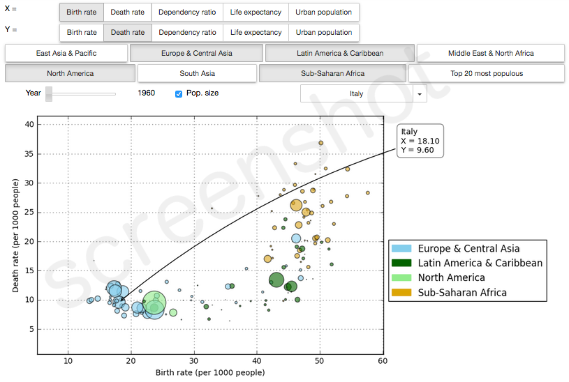
Use the upper toggle buttons to select a demographic indicator for each axis (X and Y). You can choose from:
- birth rate,
- death rate,
- dependency ratio,
- life expectancy,
- urban population.
See the World Bank indicators webpage for an explanation of these indicators.
Use the lower toggle buttons to select the world regions you are interested in.
Enjoy exploring the world evolution over the time span 1960-2014 by moving the slider!
Additional controls
Select the checkbox called “pop. size” if you want the size of the dots in the scatter plot to be proportional to the population size of each country.
Choose a specific country from the dropdown menu if you want to follow it along the evolution, or if you just want to know which dot is which country.
Data source
Libraries used
NumPy, pandas, matplotlib, ipywidgets.